These exercises use National Park visitation data from 1979–2024. For more context about the dataset, see the data essay.
Concepts covered:
Filtering data for a specific category
Line plots with custom colors and titles
Customizing x-axis tick intervals
Abbreviating y-axis labels (millions, thousands)
Adjusting axis limits to zoom into a time period
Load National Park Visitation data
Code
import pandas as pdimport matplotlib.pyplot as pltimport matplotlib.ticker as tickernp_data = pd.read_csv("https://raw.githubusercontent.com/melaniewalsh/responsible-datasets-in-context/main/datasets/national-parks/US-National-Parks_RecreationVisits_1979-2024.csv")np_data.head()
ParkName
Region
State
Year
RecreationVisits
0
Acadia NP
Northeast
ME
1979
2787366
1
Acadia NP
Northeast
ME
1980
2779666
2
Acadia NP
Northeast
ME
1981
2997972
3
Acadia NP
Northeast
ME
1982
3572114
4
Acadia NP
Northeast
ME
1983
4124639
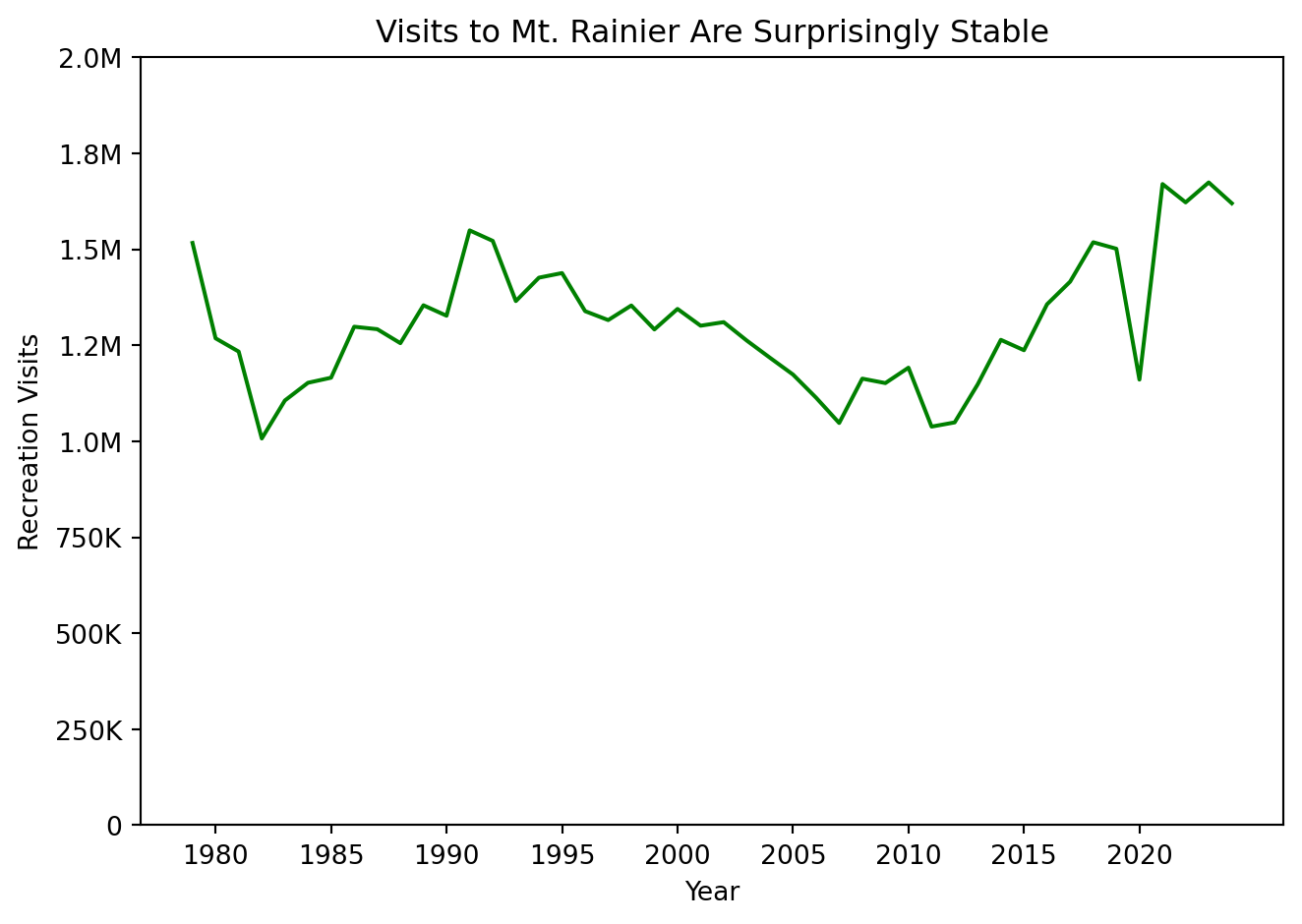
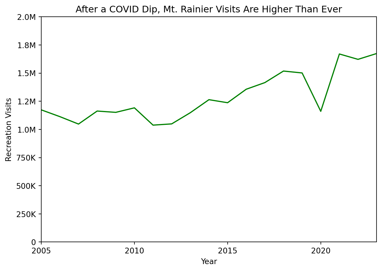
How have visits to a particular National Park changed over time?
What is the most interesting period of change?
Exercise 1
First, filter the dataframe for a park of your choice. Pick a National Park that you haven’t worked with yet, and filter the data for only that park.